


Muviz Widgets: Clock, Music.,
4.638.00 Reviews
App Specs
- Version
- 1.1.3.0
- Updated On
- License
- Free
- Downloads
- 100,000+
- Developer
- Sparkine Labs
- Categories
- Personalization
- Platform
- Android
Screenshots
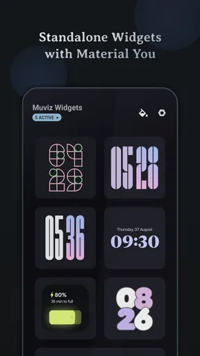
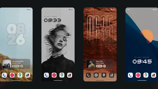
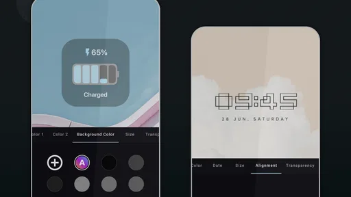
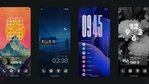
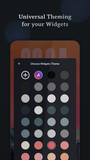
 Analysis by AppCompare
I usually judge a widget app by one question: does it make my home screen more useful, or does it merely add another layer of decoration? Muviz Widgets: Clock, Music. is interesting because its main appeal is the ability to turn everyday information into a more personal part of the Android home screen. It belongs to the personalization category, but I found its value is less about endlessly changing wallpapers and more about choosing how time, music, and the visual style of the phone meet in one place.
That focus makes it easier to recommend than a huge customization suite that tries to control every corner of the device. At the same time, it is not the right choice for everyone. If you prefer the cleanest possible home screen, or if you already have a widget setup you never want to touch, another option may suit you better. For people who want a more distinctive clock and a home screen that feels connected to their listening habits, however, this free app from Sparkine Labs is worth a closer look.
Why the widget itself is the important feature
The central capability here is the widget: a small, glanceable element placed directly on the home screen rather than an app that expects you to open it repeatedly. That difference matters. A clock widget can replace the standard time display with something that better matches the phone’s theme, while music-oriented presentation can make a listening-focused home screen feel more deliberate instead of assembled from unrelated pieces.
The app is also associated with the creators of Muviz, so the overall idea feels focused on visual information rather than on turning Android into a completely different operating system. The store summary points to Pixel Clock Widgets, Material You Widgets, and additional styles. In everyday use, that suggests a useful range between a retro-inspired look, a current Android design language, and more expressive choices.
I like this approach because a widget has a clear job. It should show information quickly, occupy a sensible amount of space, and look as if it belongs on the phone. The best result is not necessarily the most colorful design. Often, it is the one that lets me check the time without searching for the system clock, while still giving the home screen a little personality.
The real strength is not decoration alone; it is turning a glance at the home screen into a small, intentional interaction. That is a more practical benefit than simply having a larger collection of visual themes.
What the Pixel and Material You direction changes
Pixel-inspired widgets and Material You styling serve different moods. A Pixel-style clock can give a home screen a more recognizable Android character, while Material You-oriented designs are better suited to someone who wants the widget to feel connected to the phone’s existing visual language. Choosing between them is not just a matter of taste. It can determine whether the widget blends into the rest of the interface or becomes the main visual object on the screen.
Worth Reading Before You Choose

EA SPORTS FC Mobile 26 Is a Bigger Football Game, but It Takes Time

Flipboard Shows What News Apps Must Do Beyond the Feed

Switching to Android Auto Means Rethinking Your Driving Routine
Google Calendar Makes a Crowded Week Easier to Manage

Ludo King Makes the Most of the Minutes Between Plans

Baby Panda World Brings Quick Play to Modern Phones, but Its Game Library Feels Busy
I would start with the style that matches the wallpaper and icon arrangement already in place. A highly expressive clock can look excellent on an almost empty home screen but become distracting beside several app folders. Conversely, a restrained Material You choice may look too quiet if the rest of the layout is intentionally bold. This is one reason widget customization works best as a complete composition rather than as an isolated design decision.
Music-related presentation adds another layer. For someone who frequently starts or checks music from the home screen, a widget can make that routine feel more direct. It may also encourage a simpler layout: instead of filling the first page with separate visual elements, I can reserve one area for the clock and music context, then keep the rest for the apps I actually use.
Setting it up without making the home screen messy
The first practical step is to decide what the widget should replace. If I place it beside an existing clock, the result is usually redundant. I prefer to remove or move the old clock first, then test the new widget in the space where my eyes naturally land. This small decision has more effect than adding several different styles at once.
Size matters too. A large widget can make the clock easier to read and give a music-focused design room to breathe, but it also reduces the number of app icons visible at a glance. A smaller placement preserves utility while making the visual change subtler. I would try the smallest comfortable size, use the phone normally for a day, and only enlarge it if reading the information requires effort.
There is also a useful distinction between a widget that is meant to be read and one that is meant to set a mood. If I need the time during work, commuting, or cooking, legibility comes first. If the phone sits on a desk and the home screen is mostly a visual surface, style can take priority. Muviz Widgets works best when that purpose is chosen before browsing through designs.
Another practical tip is to keep the first home-screen page restrained. The clock should have enough contrast against the wallpaper, and the surrounding icons should not compete with it. A widget can appear poorly designed when the real problem is the background or the density of nearby elements. Changing the wallpaper or moving two folders may improve the result more than switching between many widget styles.
A realistic daily scenario
Imagine starting the day with the phone on a bedside table. I pick it up to check the time, then glance at the home screen before opening anything. A personalized clock gives that first check a clearer visual hierarchy. Later, while getting ready, I want to resume music without navigating through several screens. A music-oriented widget can make the home screen feel like a useful control point rather than a collection of shortcuts.
During a workday, the same setup can serve a different purpose. I might use a quiet, readable clock style on the first page and keep music access available without letting it dominate the screen. When I am finished working, the widget still feels appropriate because it does not depend on a separate work mode or a complete redesign. The value comes from reducing small moments of friction: checking time, recognizing the current visual theme, and returning to a listening routine.
This is also where I think the app is more convincing than a purely decorative customization tool. The widget stays visible while I use other apps. I do not need to remember to open a customization dashboard every time I want to benefit from it. Once the layout is settled, its usefulness becomes quiet and routine.
Where it compares well with ordinary alternatives
The standard clock widget supplied with a phone is usually the easiest option. It is familiar, stable, and often already matches the system design. If all I want is the time, replacing it may not be necessary. Muviz Widgets earns its place when the default widget feels too plain or when I want a stronger connection between the clock, the wallpaper, and the visual identity of the home screen.
Large all-in-one customization apps can offer more control over icons, wallpapers, lock screens, and other elements. Their advantage is breadth. Their weakness is that they can make personalization feel like a project. This app has a narrower purpose, which I see as a benefit for someone who wants a noticeable improvement without rebuilding the whole phone.
There is also a trade-off against standalone music widgets. A dedicated music tool may be preferable if music control is the only thing that matters and clock styling is irrelevant. Muviz Widgets is more appealing when the two ideas belong together: the home screen should both show the time in a chosen style and support a music-centered visual arrangement.
In other words, I would not call it a universal replacement for every widget app. It is a more focused choice for people who care about clock presentation and want music to have a visible place in the same personalization plan.
The limitations I noticed in the concept
The biggest limitation is that visual customization can become a maintenance task. After the initial excitement, I may stop changing the widget and simply keep one design. That is not a flaw if the chosen layout works, but it means the app’s value depends on whether I actually care about the appearance of the home screen over time.
There is also a space cost. Any prominent widget takes room away from icons, folders, or a clean wallpaper. Users with compact launchers or small displays may need to choose between a larger, easier-to-read clock and quick access to more apps. I would not install it expecting to preserve exactly the same layout while adding a visually important element.
Another consideration is the difference between a polished preview and a comfortable daily setup. A style can look impressive while browsing but prove too bright, too dense, or too small once used in changing light. I recommend testing readability in both a dark room and outdoors before committing to a design. The most attractive option is not always the one I can read fastest.
The app is free to install, with in-app purchases priced at $2.49 per item. That keeps the initial barrier low, but anyone who wants to explore paid choices should decide in advance how much customization is genuinely useful. I would begin with the free experience, settle on the kind of widget I need, and only then consider an individual purchase rather than collecting styles simply because they are available.
It is also worth remembering that the app is intended for Android and requires Android 12 or later. That makes its Material You direction especially relevant for compatible devices, but it excludes phones running older system software. On supported phones, the current version is 1.1.3.0, so I would keep the app updated when possible to benefit from the developer’s ongoing refinements.
Who gets the most from it
I think the strongest audience is someone who looks at the home screen often and wants it to feel considered without installing a full launcher replacement. That includes people who enjoy Pixel-inspired design, users who like Material You styling, and listeners who want music to have a visible role in their everyday layout.
It is also a good fit for someone who changes wallpapers or themes regularly. A clock widget can act as the stable element that keeps those changes from feeling random. Instead of rebuilding the entire home screen each time, I can keep the same basic structure and adjust the surrounding wallpaper or icons while the widget maintains a recognizable anchor.
People who use their phone as a desk display may appreciate it for a different reason. A clear clock can be seen from a short distance, and the visual style can make the device feel less like a spare screen. That use case depends on choosing a readable design and a suitable size, but it shows why the widget can be more than a novelty.
I would be less likely to recommend it to someone who wants maximum launcher control, advanced automation, or a completely minimal interface. A launcher with deeper layout tools is a better choice when the goal is to redesign navigation itself. Likewise, if the default clock already looks right and music is handled through headphones or a separate device, this app may not add enough to justify changing the home screen.
What the audience response suggests
The app has reached over one hundred thousand installs and holds a 4.6 average from around four thousand ratings. Those figures suggest that the idea is resonating with a substantial Android audience, especially people who want a more distinctive widget experience without paying to try the app first.
The age rating is Everyone, which fits the straightforward personalization purpose. I would still judge it by practical compatibility rather than by the rating alone: the important questions are whether the phone runs Android 12 or later, whether the home screen has room for a widget, and whether the user actually wants a clock or music element visible throughout the day.
Its release date was December 17, 2025, so I see it as a relatively recent addition to the personalization space rather than a long-established utility that has been part of Android for years. That makes the current version worth evaluating on its own merits, while also making it sensible to keep expectations focused on the widget experience instead of expecting a complete ecosystem of phone customization.
My recommendation after using the idea in practice
I would install Muviz Widgets: Clock, Music. when the standard clock feels too generic and I want one meaningful change to the home screen. My preferred approach would be to choose one readable style, place it where the old clock was, remove duplicate information, and then build the surrounding layout around that decision. That produces a calmer result than filling the screen with several competing widgets.
The app is not essential, and that is part of its honest appeal. It solves a specific personalization problem rather than pretending to transform every aspect of the phone. Its best results come from matching the widget to a real habit: checking the time frequently, keeping music close, or using the home screen as a visual space that deserves more character.
For Android users on a compatible device, the free starting point makes experimentation easy. The optional $2.49-per-item purchases are reasonable only when a particular design solves a problem or completes a layout I will actually keep. I would skip impulse buying and judge each style by readability, space usage, and how naturally it fits the rest of the phone.
My final view is positive but specific: Muviz Widgets: Clock, Music. is best when you want the home screen to communicate both time and personality at a glance. It is more focused than a full customization suite, more expressive than a basic system clock, and most rewarding for users who want a polished visual anchor without redesigning their entire Android experience.
Pros
- Wide selection of stylish clock and music widget designs
- Music controls are convenient directly from the home screen
- Widgets can match wallpapers
- themes
- and personal style
- Supports useful at-a-glance information without opening apps
- Customization options make the home screen feel more personal
Cons
- Some advanced designs and features may require in-app purchases
- Certain widgets can use extra battery when frequently animated
- Compatibility may vary across Android launchers and device brands
- Setup can take time if you want a highly customized appearance
- Music controls may not work equally well with every player app
FAQs for Muviz Widgets: Clock, Music.,
What is Muviz Widgets: Clock, Music?
Muviz Widgets: Clock, Music is a customization app designed to add stylish clock and music-related widgets to your Android home screen. After exploring its interface, the app stands out for combining practical time displays with visual controls for music playback. It is aimed at users who want their home screen to feel more personal without installing a complete launcher or changing the phone’s entire theme.
What types of widgets are available in Muviz Widgets: Clock, Music?
The app offers a selection of clock and music widgets in different visual styles, layouts, colors, and sizes. Depending on your device and the app version, you may find minimal digital clocks, decorative designs, music controls, album-related elements, and widgets intended for always-on or lock-screen-style customization. The exact catalog can change, so checking the available designs inside the app is recommended before downloading.
How do I add Muviz Widgets to my Android home screen?
After installing the application, open your phone’s widget picker by pressing and holding an empty area on the home screen. Find Muviz Widgets in the list, choose the desired clock or music widget, and drag it onto the screen. You can then resize it and adjust its appearance through the app. Some Android launchers may use slightly different steps or limit widget placement.
Does Muviz Widgets: Clock, Music work with every music player?
Muviz Widgets is intended to display music information and provide playback controls, but compatibility can depend on the music service, player, Android version, and permission settings. Popular music applications may work more reliably than lesser-known players. If controls do not respond, verify notification access, media permissions, battery restrictions, and whether the music app allows external playback controls.
Is Muviz Widgets: Clock, Music free to use?
The application may provide free widgets and customization options while reserving certain designs, advanced settings, or exclusive styles for premium access. Availability can vary according to the current version and regional store listing. Before downloading or subscribing, review the in-app purchase details, trial conditions, and renewal information carefully. The free features are generally sufficient for users who only need basic clock customization.


